“Why is Japanese so expensive in comparison to other Asian languages?” – this is a question that we are regularly asked by customers, and by colleagues in other STAR offices too. Yet it cannot be answered in a single sentence.
The following explanations are an attempt to give readers some greater clarity on the situation.
Socio-cultural differences
It’s not just a cliché – customer focus and the notion of service are still very important in Japan, despite the increasing awareness of price and sustainability over here; the expectations and demands placed on consumer goods are extremely high. Most Japanese consumers are happy to pay a higher price for quality branded goods, provided they meet their expectations and the complete package is just right.
And what applies to consumer goods, naturally also applies to the services industry, which brings us to the topic of translation.
So, what does this (extra) level of service actually look like as part of the translation process?
Example 1
Japanese is known for its many forms of polite speech – both in the spoken word and the written word. Naturally, the document type, data medium, target audience, etc. must not be ignored during translation into other languages, however, in Japanese, the nuances are undoubtedly more precise and the adaptations require more work.
Let’s try to make this variation a little clearer: At a very basic level, there are three different forms of polite address. 尊敬語 (reverential), 謙譲語 (humble), 丁寧語 (polite), which are then divided into many different subgroups depending on the word in use. Let’s take the verb “to think” as an example. For this simple word alone, there are ten (yes, ten!) different variants, as the table below shows. Note that these are not synonyms, but instead it is the same verb used in different situations.

If you take into account that there are also differences in forms of expression between men and women (admittedly this is slightly outdated), then it becomes much easier to understand how much you can get “wrong” when translating. In which case, as the quotation marks suggest, it is often not actually a translation error, rather in many cases it is a question of personal preference that depends on who is checking the text.
Example 2
An example that is directly linked to the point above has to do with the frequent use of irony or ambiguity in marketing texts. When addressing their customers in advertisements, European languages often love to use both of these elements, as a means of sharing a joke or an unspoken jibe at their competition, for instance.
While this works well in Western markets, it causes problems in Japan, as these rhetorical devices would imply that the end user is being spoken down to. Result: A translation that is technically correct, but will nonetheless be considered “wrong” by the end user.
Example 3
Use (or lack) of footnotes for disclaimers: Footnotes are common practice in Western marketing and sales literature, for example, to indicate optional equipment shown in the product image or limited availability, but these are only used in Japan in rare exceptions. The reason for this is plain and simple; Japanese customers expect perfectly localised content.
Example 4
Owing to the standards highlighted in example 3, during customer review, the translations are not just checked for errors but are subject to extensive market-specific changes.
The logical consequence of this is that any non-Japanese observer might confuse or equate the many “corrections” with “incorrect” translations.
Of course, the above examples only show part of the full picture and they can only give a small insight into the difficulties encountered when translating into Japanese.
Undoubtedly, the fact of the matter is that when translating into Japanese, the context (who is the document aimed at, how will it be published, etc.) and framework information (e.g., specifications for Japanese texts) are indispensable.
Economic situation
A widespread misconception that is always being thrown around Western media states the following: “In Japan, apples and melons cost 100 euros each and everything else is unaffordable.”
This statement isn’t completely false; there are actually apples in this often cited price category and there are even people who buy them (we’re back to socio-cultural differences – apples as a status symbol), but – never fear – you can also buy apples for 1 euro each!
Nevertheless, when compared to the majority of their Asian neighbours, the price and salary structure in Japan is proportionally high and the GDP per capita is correspondingly higher than in Europe.
As the fruit example shows, you cannot generalise, however there is an underlying trend. Defining unit prices (or even attempting to standardise) for different languages does not match reality. If a tradesman in Berlin worked for the hourly rate that is standard in Prague, he would probably soon struggle to make ends meet. To a certain extent, the same could be said of Tokyo and Bangkok.

This state of affairs is naturally well known, and is nothing new – but when it comes to translation, it is often overlooked.
Another important factor: Supply and demand of resources. Japanese is not only geographically but also linguistically isolated to a certain extent as there is not a language family that it can be grouped into. When a language falls within a large family of languages, as is the case with German (west-Germanic/indo-Germanic family), there are, in principle, more resources available for that language. If there are more translators, the costs are lower.
DTP (desktop publishing) – Japanese sentences
It sounds simple in principle: Select the customer’s preferred font, insert the text, done.
So it can’t really be that difficult, can it?
But if you take a closer look, it quickly becomes clear that a simple copy and paste won’t quite cut it in Japanese, and language-specific skills are essential.
When typesetting in Japanese, different writing systems need to be harmonised: Chinese characters (kanji 漢字), Japanese syllabic characters (hiragana ひらがな and katakana カタカナ), Latin alphabet, Chinese and Indo-Arabic numerals.
As if that weren’t enough, Japanese can also be written both horizontally and vertically.
Bringing all of these typographical elements together and creating a unified form out of the chaos can sometimes be rather time-consuming. Though Chinese and Japanese may not look hugely different from one another to the layperson – having several writing systems, as is the case for Japanese, ultimately also acts as a multiplier when it comes to effort needed.


*Example Japanese magazines. The majority of magazines in Japan are set out with pages to be read from right to left, even if the majority of the text is set out horizontally.
InDesign: Japanese special functions
All InDesign versions, regardless of the language used, are naturally compatible with one another. This means European versions can open a Japanese InDesign file and vice-versa.
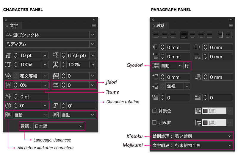
However, the InDesign version for European languages does not include the typographical functions or layout grids and text frames needed to edit Japanese texts.
If you are familiar with the software, one look at the paragraph and character panels will make this immediately obvious.

More information about “Kinsoku-Shori”, “Mojikumi” etc. can be found here.
Japanese texts do not flutter
Most written languages in the world use some form of separation between words. Lines of text are broken at the gaps between words. The lengths of lines vary because words the are a different length. This can give the impression that the text is fluttering. However, Japanese is written without spaces and, aside from a few exceptions – which, nevertheless, absolutely must be taken into account – a line break can be inserted in the middle of a word after any character.
Because of this, there is no ragged margin in Japanese, like you would commonly find in Western texts. For the vast majority of cases, Japanese texts use full justification.
Where full justification is not applicable, for example, in assorted headings, teasers or image captions, text is set out with a ragged margin with line breaks following content considerations rather than being placed according to the space available. So, this should mean that the text is easier to read for DTP.
Japanese fonts
The fonts that are used in brochures, instructions or flyers created in Germany, often do not cover Asian writing systems such as Chinese, Japanese or Korean.
Global, or world fonts are extremely complex to create; 26 Latin letters would require up to 50,000 characters or glyphs. This means that the fonts used in the source document often cannot be used in the layout work for the Japanese translation.
The “Latin” fonts must therefore be replaced or combined with Japanese fonts – an additional and often intensive work step. It requires careful consideration to retain the optical design and impression of the original, since – even though it may not be obvious to the untrained eye – Japanese fonts still have a wide range of personalities.
Ranging from classical, “serif” style fonts with a decidedly traditional feel to clear, modern “sans-Serif” style fonts, anything is possible.
We would be happy to advise you on the selection of Japanese or Asian fonts that will best match your corporate design identity.

Varieties of different Japanese fonts
If you need more detailed information and have questions about Japanese and everything it entails – we are always available to advise and assist.


